

Clinton vs. Sanders (Nigel Paray for CNN)
Actual Results:
Sanders did very well since my last update. He has cut into Clinton’s pledged delegate lead by almost 100 delegates, whittling her advantage from 326 to 230. Clinton now holds a 55.0% to 45.0% advantage vs. Sanders in total pledged delegate %. Furthermore, Sanders has reduced his % of pledged delegates remaining needed to win the pledged delegate vote, from 58.0% on our last update to 56.6% today. This means that if Sanders wins 56.6% of the remaining pledged delegates, he would win the battle for pledged delegates (and by extension, the popular vote).
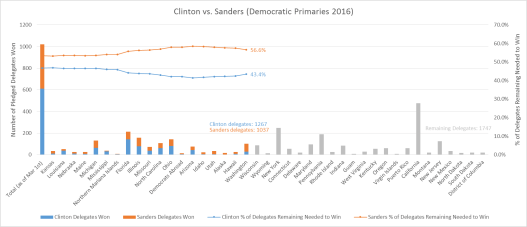
Fig 1. The graph shows (off the left-hand axis) the number of pledged delegates won by Clinton and Sanders by state and cumulatively (Clinton in blue and Sanders in red); the remaining pledged delegates in the race (in gray); and the % of those remaining delegates needed to win for each candidate (off the right-hand axis).
Analysis of Actuals vs. Projections:
The model projected a lead of 397 pledged delegates for Clinton at this point, for a 58.6% vs. 41.4% Clinton lead, so the model is clearly over-projecting in favor of Clinton (by +3.6%). Final model projections are +590 pledged delegates and a 57.3% vs. 42.7% win for Clinton. Projections were developed right after Super Tuesday on March 1st and will not be changed. See here.
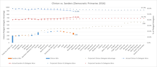
Fig 2. The graph shows (off the left-hand axis) the delegates won or lost by Clinton after each primary (blue bars mean Clinton won the state; red means Sanders won); the size of the bars reflect the difference in delegates won or lost for each state. The bars are staggered in “water-fall” fashion to reflect Clinton’s actual total delegate lead, which is compared against model projections of Clinton’s delegate lead (black dots). The graph also tracks (off the right-hand axis) actual delegate % won for Clinton (blue line) vs. Sanders (red line), and compares against model projected % for Clinton (blue dots) vs. Sanders (red dots)

Table 1. The table tracks actual pledged delegates won by Clinton and Sanders vs. model projected delegates, and calculates the delta between the two
The model projections under-performed relative to Sanders’ actual win totals. This can be explained because of 2 reasons:
1) Given that the model works based on a regression of “racial demographics”, it’s important to have good demographic data. The misses on Democrats Abroad, Alaska and Hawaii can be attributed to no demographic and poor demographic data, respectively (we had no demographic data for Democrats Abroad, and Alaska and Hawaii don’t fit our simple White/Black/Hispanic bucketing very well). As such, these misses are not big surprises.
2) A more interesting phenomena is Sanders’ performance in caucus states. Although the model predicted that Sanders would win Idaho, Utah and Washington (and Kansas previously), clearly, he does much better than expected based on projections using simple demographics. I would argue that this is because the caucus format rewards Sanders’ base much more so than Clinton’s.
The so-called “enthusiasm gap” manifests itself in these formats, where people are expected to caucus for significant chunks of the day, and Sanders certainly has very dedicated supporters. As such, when the caucus format is over-layed on top of demographics, this exacerbates the difference in victory in favor of Sanders. This can be contrasted to the primary format, which is less “demanding” of voters and where Clinton does much better than Sanders, and where demographic projections seem right in line with results.
One could also add an additional variable around whether the primary/caucus is open or closed (closed implies only registered Democrats can vote, whereas open implies anyone can register and vote; there are formats in-between as well), where Clinton seems to do better than expected in the closed format given her large lead with registered Democrats.
As such, in retrospect, adding secondary variables around “primaries vs. caucus format” and perhaps “open vs. closed” in the model to complement the primary predictive demographic variables would have likely enhanced results.
Analysis Going Forward:
The bad news for Sanders is that are only 4 remaining caucus states left (Wyoming, Guam, Puerto Rico, Virgin Islands), and they are all relatively small and closed caucuses. Going forward, Wyoming is a closed caucus, Wisconsin is an open primary, and the next states through April 26 are all closed primaries (Rhode Island is semi-closed), including the big states of New York and Pennsylvania. As such, I expect Clinton to slightly outperform her demographic projections. Despite Sanders’ strong performance over the past couple of weeks, I still strongly believe that Clinton will beat Sanders, and I suspect when it’s all said and done, she will do so within ~3% of initial model projections. More to come. Next update after New York.
How the model “works”:
The model regressed delegates won by Clinton vs. Sanders for primaries on March 1st and before against the “racial makeup” of those states. The resulting regression coefficients are then used to project future primaries based on the “racial makeup” of those future states.
