

Clinton vs. Sanders (Nigel Paray for CNN)
The purpose of this post is to present a final tally of the Clinton vs. Sanders primaries. As everyone already knows, Clinton beat Sanders rather handily, so this post is really for completeness. Having said that, I will also discuss the performance of the regression model I developed in more detail, present the mathematical formulation in case people are interested, as well as provide the code used to generate the regression results. I may write a follow-up post with detailed analysis and a breakdown of the numbers by state, by demographic category etc, but that will depend on how much time I have available.
Actual Results:
The final pledged delegate count is 2205 vs 1846 in favor of Clinton. As such, the final margin is 359 pledged delegates. Clinton won 54.4% of total pledged delegates vs 45.6% for Sanders. Note that Clinton won the popular vote by a larger margin than the pledged delegate vote given that Sanders won the a large number of pledged delegates in caucus states that had very low voter turnout. Here’s the final tally:

Table 1. The table tracks actual pledged delegates won by Clinton and Sanders vs. model projected delegates, and calculates the delta between the two
Analysis of Actuals vs. Projections:
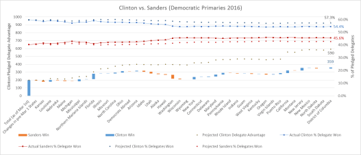
Fig 1. The graph shows (off the left-hand axis) the delegates won or lost by Clinton after each primary (blue bars mean Clinton won the state; red means Sanders won); the size of the bars reflect the difference in delegates won or lost for each state. The bars are staggered in “water-fall” fashion to reflect Clinton’s actual total delegate lead, which is compared against model projections of Clinton’s delegate lead (black dots). The graph also tracks (off the right-hand axis) actual delegate % won for Clinton (blue line) vs. Sanders (red line), and compares against model projected % for Clinton (blue dots) vs. Sanders (red dots)
So how did the model do overall? Final tally gives Clinton 54.4% of pledged delegates, whereas the model projected 57.3% (Sanders won 45.6% of pledged delegates vs. model projections of 42.7%). So the model clearly was “biased” towards Clinton, but still, given that these projections were made over 4 months ago (and remained unchanged), coming in within less than 3% of actuals (2.9% to be exact) is pretty good!
A different cut of the data suggests a similarly predictive story. There were 41 contests after March 1st for which we made predictions. The model correctly predicted 33 out of the 41 contest winners; that’s an 80%+ success rate. The model misses were Michigan, Democrats Abroad, Alaska, Hawaii, Connecticut, Indiana, Kentucky and South Dakota. What accounts for these misses?
- Bad demographic data: Recall that the model works off of the “racial” demographics of states, and buckets them into 3 broad categories (White, Black, Hispanic) and a catch all Other category; if the demographic data available is poor or doesn’t “fit” this bucketing (especially if the Other category for a state is large), the projections will be a crap-shoot. We did not have good demographic data (or the data bucketing was poor) for the Northern Marianas, Democrats Abroad, Alaska, Hawaii, Guam, Virgin Islands or Puerto Rico, and so it isn’t a surprise that the model missed 3 out of those 7 contests (in retrospect, I shouldn’t have even attempted a projection of these contests given that the regression coefficients for the Other bucket were very much dependent on the results of tiny American Somoa).
- Very close results (that could have gone either way): The model predicted very narrow victories for Sanders in Connecticut, Kentucky and South Dakota, whereas actual results very narrowly favored Clinton. The delta between actual number of pledged delegates won by Clinton (or Sanders) versus those predicted by the model was 1 for each one of those states.
- Legitimate misses: The model missed both Michigan and Indiana by relatively wide margins. One can say that demographics in these states were clearly not the only story.
One final note on factors beyond demographics. As the race progressed, it became clear that the format of the contest (primary vs. caucus; open vs. closed etc) played an important, though secondary role, in the race. Demographics were still primary in predicting the race, but it’s also likely that including the format of the contest could have made the predictions more accurate. Having said that, it’s rather remarkable that something as crude as the “racial make-up” of the Democratic electorate could have such predictive power.
How the model “works”:
In the embedded document below, I provide details of the regression model actually used, including the mathematical formulation as well the code used to generate the regression coefficients that are then used in the projections.
